Composition
Composition is the arrangement of elements within a work of art. The term composition means 'putting together' and can apply to any work of art, from music to writing to photography, that is arranged using conscious thought. In the visual arts, composition is often used interchangeably with various terms such as design, form, visual ordering, or formal structure, depending on the context
The elements of design are:
-
Line — the visual path that enables the eye to move within the piece
-
Shape — areas defined by edges within the piece, whether geometric or organic
-
Color — hues with their various values and intensities
-
Texture — surface qualities which translate into tactile illusions
-
Value — Shading used to emphasize form
-
Form — 3-D length, width, or depth
-
Space — the space taken up by (positive) or in between (negative) object
Subject lines contribute to both mood and linear perspective, giving the viewer the illusion of depth. Oblique lines convey a sense of movement and angular lines generally convey a sense of dynamism and possibly tension. Lines can also direct attention towards the main subject of picture, or contribute to organization by dividing it into compartments.
The idea of composition as the adjustment of the relationships of the elements of the work within the border of the canvas, remained unchallenged through the upheavals of the early modern movements such as cubism and abstract art.
composition in different subjects and circumstances

composition in graphic design: layouts

Movie Scenes
The color of pomegranate (Sergei Parajanov)
Painted Skin (Gordon Chan)

still life - surrealism


I have always been drawn to the atmosphere of the black and white photography, there is something uplifting in being in a space with no color. the movement of the shadow and the texture of everything seems more audible- the quietness is so loud. Now, the excitement is just about the shade and form, instead of the tone of different colors.
If black and white photography is a powerful single note in a song, color photography is a harmonious chord contents differents elements. It willingly shows its character and mood by color choice. In reverse, B&W photograph leaves the audience with the imagination and the mystery with it. Also, most of the attention will focus on the main object's physical expressions in this type of photography. People will raise questions with their curiosity about the B&W hint. What was the time when they do the shoot? What is the primary message the creator first consider? - because from our point of view and perception it might be changed.
Photographer and Photography

Jacques Tati
Mon Oncle, Play Time

Throughout his career, Jacques Tati focused on capturing the period of transition caused by the rise and spread of the modernist movement. The movement began in the mid-1800s as artists sought to move away from the ornament and formality of the past artistic and architectural styles. They desired a means to express their feelings about the evolving modern world. Rather than having a uniform artistic style, the movement saw the birth of many new styles of art, including cubism, surrealism, and abstract expressionism, as different artists experimented with their ideas about how to portray modern life.
Tati plays on the idea of the anonymity and conformity of modern architecture by setting almost every scene within essentially the same architecture, whether it’s an airport, an office building or a hotel. In the exterior shots, these carbon copy modern buildings continue for as far as the eye can see. Every location, despite the different functions, features large open spaces that feel sterile and uninviting. Floors are too sleek and slippery, furniture is awkward and uncomfortable. Many of the “modern” contraptions are unwieldy and impractical.
One by one, the house’s futuristic gizmos malfunction, from the uncontrollable electronic garage doors that open and close inexplicably, to the inscrutable kitchen gadgets.
One particularly amusing set features a maze-like grid of identical cubicles. With every office looking exactly the same, Hulot ( movie character) quickly loses his bearings while searching for someone. When viewed from above, the audience is able to witness a great comedic scene where two colleagues go back and forth on the phone, despite being with earshot of each other. One of them even passes by the other’s office, but returns to his own cubicle to finish the conversation on the phone. This scene and other instances throughout the film show the increasing lack of human interaction that has become all too common in modern society. I find it fascinating that nearly fifty years since Playtime came out, this is an issue, as well as so many others put forth in the film, are ones that we are still grappling with today.
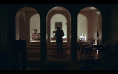
Cinematography: The majority of the movie exists in a monochromatic world of grays, whites and blues. In some scenes, though, he purposefully uses pops of bright colors to draw the audience’s attention somewhere. The Royal Garden Club is the most colorful set, which contrasts the bleak monotone world of the office buildings. This instantly creates a warmer and more joyful atmosphere. Another interesting use of color is in the drug store scene where the entire store is clothed in an unpleasant shade of green that warps the appearance of the food that’s being sold.
PHOTOGRAM
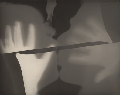
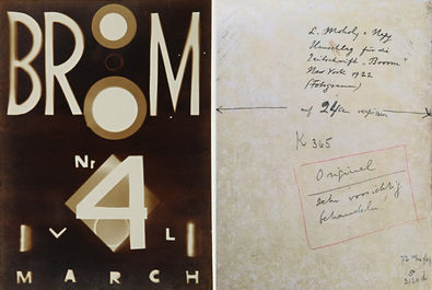
Man Ray and Laszlo Moholy-Nagy

A photogram is a photographic image that is made without a camera. Objects are placed directly onto the surface of a light-sensitive photographic paper and then exposed to light in a darkroom. The paper is then developed by using light-sensitive chemicals in the darkroom.
The photogram, with its capacity for abstract compositions and bold contrasts, was regarded for the first time as an art object. It became a fundamental Modernist tool, used in particular by Dadaists such as László Moholy-Nagy (1895-1946) and Raoul Hausmann (1886-1971) to enforce their new mode of vision, and others who merged the technique with photomontage, including Pablo Picasso (1881-1973) and Russian constructivist Alexander Rodchenko (1891-1956).
It was German Dada artist Christian Schad (1894-1982) to first re-introduce the technique around 1918, to capture the discarded objects he collected and arranged randomly. This practice reflected the movement’s interest in everyday mass-produced objects by artists such as Marcel Duchamp (1887-1968). But it was Man Ray who took the art form to the next level.
Likewise, Man Ray “used chance and dislocation of ordinary things from their everyday settings to surprise his viewers into a new awareness.” For instance, he incorporated the idea behind the readymade into his paintings, sculptures, films and photographs. This could be seen as early as 1916, when he exhibited his first proto Dada object, an assemblage on paper titled Self Portrait. Located somewhere between a collage, sculpture and painting, the artwork was composed of signs including a handprint, music symbols, speakers and a doorbell to signify the artist’s presence. It was set in a vague space that resembled an architectural niche. Like the readymade, space and background were recognizable objects that, when juxtaposed, were made into something new.
In addition to making objects, Ray developed a unique photographic means of image making. His foray into the photogram process was the accidental result of making contact prints from large plates using a glass negative on a sheet of light-sensitive paper. Ray later recounted the episode:
One sheet of photo paper got into the developing tray—a sheet unexposed that had been mixed with those already exposed under the negatives—I made my several exposures first, developing them together later—and as I waited in vain a couple of minutes for an image to appear, regretting the waste of paper, I mechanically placed a small glass funnel, the graduate and the thermometer in the tray on the wetted paper. I turned on the light; before my eyes an image began to form, not quite a simple silhouette of the objects as in a straight photography, but distorted and refracted by the glass more or less in contact with the paper and standing out against a black background, the part directly exposed to the light.
With the photogram, which he dubbed “Rayograph,” Ray applied his affinity for everyday objects and randomness of technique. He described how he made his early experiments with the medium, “taking whatever objects came to hand; my hotel-room key, a handkerchief, some pencils, a brush, a candle, a piece of twine.”
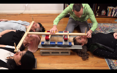
rube goldberg machine

modernist architecture
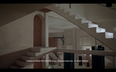
A solution to deal with an increase in demand, architects in the early 1900’s also began to rethink the entire concept of built space. Many disliked the excess and futility of previous architectural styles and sought to both simplify design and improve function. As I’m sure we all know, the moniker of the modern architecture movement became “form follows function”. The 1920’s saw the rise of the revolutionary Bauhaus school and the emergence of architects like Walter Gropius and Ludwig Mies van der Rohe. The Bauhaus architects, as well as others, including Le Corbusier, focused on three main design objectives: rational use of materials, lack of ornament and open structures that unified the indoor and outdoor space. Their buildings usually featured large open-planned spaces, extensive use of concrete and large glass windows and curtain walls. These design choices were viewed as the most functional and enjoyable use of space for the modern life-style. Soon, these innovative ideas were being used all over the world and in all types of spaces, from individual homes and apartment blocks, to office buildings and schools. This modern architectural style even became known as the International style because of its wide-spread implementation. Nearly every major city around the world would come to have their own supply of these open-planned steel and glass structures.

Metabolism is a modern architecture movement originating in Japan and most influential in the 1960s—trending roughly from the late 1950s to the early 1970s. The word metabolism describes the process of maintaining living cells. Young Japanese architects after World War II used this word to describe their beliefs about how buildings and cities should be designed, emulating a living being.
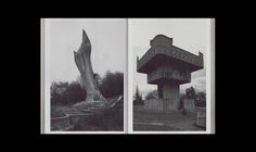
Brutalism, also known as Brutalist architecture, is a style that emerged in the 1950s and grew out of the early-20th century modernist movement. Brutalist buildings are characterised by their massive, monolithic and ‘blocky’ appearance with a rigid geometric style and large-scale use of poured concrete. The movement began to decline in the 1970s, having been much criticised for being unwelcoming and inhuman.

